Data Visualization with Pandas and Matplotlib
Author: Pete Bryan (@MSSPete)
Project: Infosec Jupyter Book
Public Organization: Microsoft
License: Creative Commons Attribution-ShareAlike 4.0 International
Reference: https://pandas.pydata.org/pandas-docs/stable/getting_started/intro_tutorials/04_plotting.html
Description
When working with data visualziations can be a powerful tool to help you understand the data that you have, and they can be much more effective at helping you identify patterns, trends, and anomalies than raw data analysis alone can.
Python has a wide range of excellent, flexible, and powerful data visualization libraries however when working with data in Pandas the built in integration between Pandas and Matplotlib provides the fastest, and easiest way to simply plot your data. If you are planning on creating a complex, interactive visualization you are better placed using something like Bokeh but whilst learning or experimenting the features provided by pandas and matplotlib are likely to be enough.
Pre-requisites - Reading
Importing Libraries
Pre-requisites:
pip install pandas
pip install matplotlib
import pandas as pd
import matplotlib.pyplot as plt
# Import our network data - originally from https://github.com/hunters-forge/mordor/tree/master/datasets/large/apt29/day1/zeek
plotting_df = pd.read_csv("../../../datasets/flow_logs.csv", index_col=0, parse_dates=True)
Line Plot
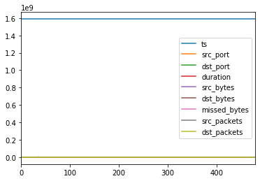
The simplest plot is a line chart, you can plot a line chart of all numerical columns in your Pandas DataFrame with df.plot(). Depending on your dataset this may not produce a very interesting or usable visualization. Often (as with this dataset) this is not the best chart to plot.
plotting_df.plot()
<matplotlib.axes._subplots.AxesSubplot at 0x1427df3bac8>
Bar Plots
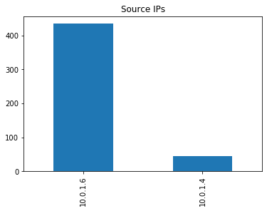
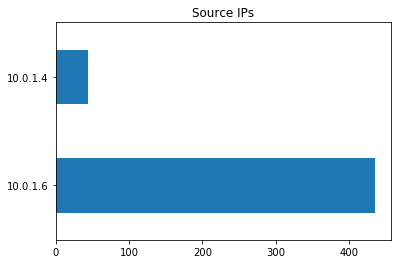
You can plot data in veritcal or horizontal bars. You can also plot on a range of data summarizations such as value_counts() as we are using here.
plotting_df['src_ip'].value_counts().plot.bar(title="Source IPs")
<matplotlib.axes._subplots.AxesSubplot at 0x142000a6278>
plotting_df['src_ip'].value_counts().plot.barh(title="Source IPs")
<matplotlib.axes._subplots.AxesSubplot at 0x14200159518>
Pie Charts
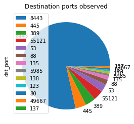
There are a number of customizations for each chart such as showing a legend, which is useful for a pie chart.
plotting_df['dst_port'].value_counts().plot.pie(legend=True, title="Destination ports observed")
<matplotlib.axes._subplots.AxesSubplot at 0x1420386e2b0>
Other charts
There are a number of other chart types avalibale, some of which are shown below. You can select axis to plot either before calling the plot function or as x and y parameters Avaliable charts:
Area
Bar
Horizontal Bar
Box
Density
Hexbin
Histogram
Line
Pie
Scatter
Box Plot
Kernel Density Estimate
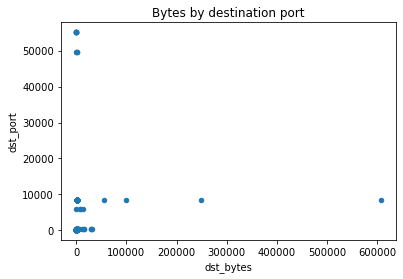
plotting_df.plot.scatter(y="dst_port", x="dst_bytes", title="Bytes by destination port")
<matplotlib.axes._subplots.AxesSubplot at 0x142038094e0>
Some plots can also be done on a Pandas Series:
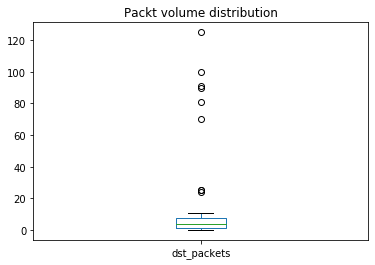
plotting_df[plotting_df["dst_port"] <1023]["dst_packets"].plot.box(title="Packet volume distribution")
<matplotlib.axes._subplots.AxesSubplot at 0x142037396a0>
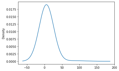
plotting_df["dst_packets"].plot.kde(2)
<matplotlib.axes._subplots.AxesSubplot at 0x142004ac048>
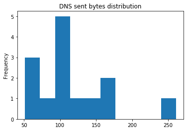
You can also apply Pandas conditional statements prior to plotting data:
plotting_df[plotting_df['dst_port']==53]['dst_bytes'].plot.hist(title="DNS sent bytes distribution")
<matplotlib.axes._subplots.AxesSubplot at 0x1420379f630>
Subplots
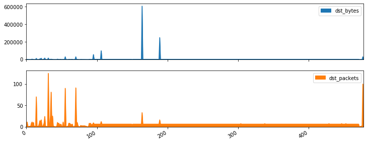
By default if plots will include all columns in the DataFrame provided overlayed into one chart. You can set subplots=True parameter to split each column into a seperate plot. You can also resize your plots with the figsize parameter.
plotting_df[['dst_bytes','dst_packets']].plot.area(figsize=(12, 5), subplots=True)
array([<matplotlib.axes._subplots.AxesSubplot object at 0x00000142024548D0>,
       <matplotlib.axes._subplots.AxesSubplot object at 0x00000142024886A0>],
      dtype=object)
Summary
As you can see Pandas and Matplotlib gives you a very easy and simple way of creating a number of visualizations. Also as is clear with some of these visualizations some fit certain data types better than others, when creating visualizations its important to consider what data you you have and what analysis you are looking to get from the visualization. For more details on plotting data with Pandas refer to the documentation.